

RELAXING PAINT COLORS FOR A GUEST ROOM
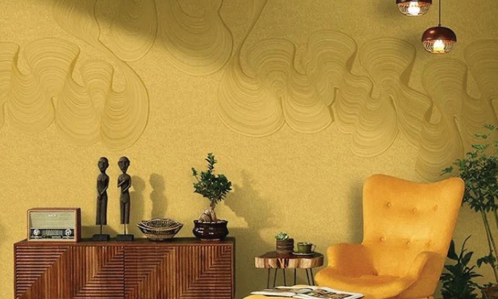
When you’re hosting guests, the most important thing is to make sure they feel comfortable. You want to make the room a place where they can relax and get a good night’s sleep, and the paint color you choose can really have a big impact on how your guests feel when they’re in the room. […]
Choosing the Right Paint Colors for Your Home
our home’s color scheme sets the tone for the entire space and can significantly influence the mood and atmosphere of each room. Picking the perfect paint colors is a fun yet challenging aspect of interior design, but with a few tips and tricks, you can transform your home into a haven of your own. Let’s […]
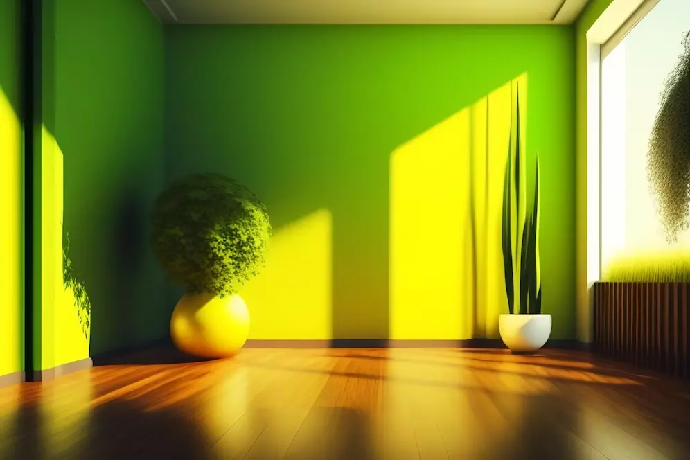
Colour Psychology: Choosing the Perfect Paint Shades for Interiors

A colour palette unifies the look of your house. Every colour influences your mood differently, which is the foundation for using colour psychology in home design. Colour psychology examines various shades as triggers for emotions and perception. It then applies this knowledge to develop a harmonious colour palette that aligns with the intended atmosphere of […]
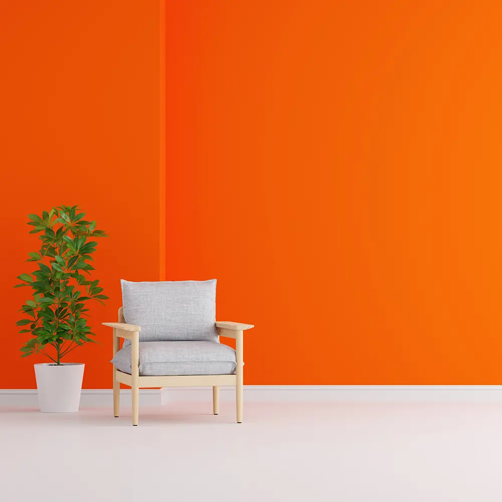
Colour Trends 2023: Discover Top 10 Shades for Your Home Makeover
Choosing the right paint colour can completely transform the look and feel of your home. Whether planning a complete interior makeover or just repainting a few rooms, staying up-to-date on the latest colour trends is essential. In the fast-moving era, interior designers and home painting services are predicting a variety of exciting shades that will […]